


Shiny Controls v1.0 - The Ultra Control Suite for .NET MAUI & BlazorO...M...G!
VirtualizedGrid
A high-performance virtualized grid that supports optional grouping with sticky headers, orientation-aware column counts, and built-in load-more pagination. Only the items currently visible in the viewport are created and measured, keeping memory use flat regardless of data set size.


Frameworks
.NET MAUI
Blazor
MAUI
| Flat (240) | Grouped | Load More Modes | Load More Button |
|---|---|---|---|
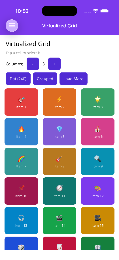 |
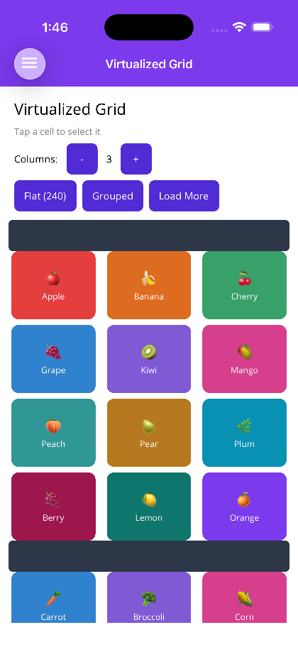 |
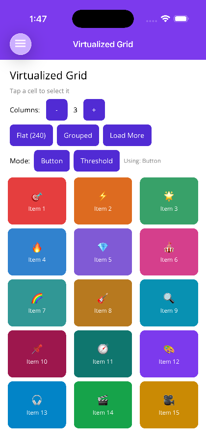 |
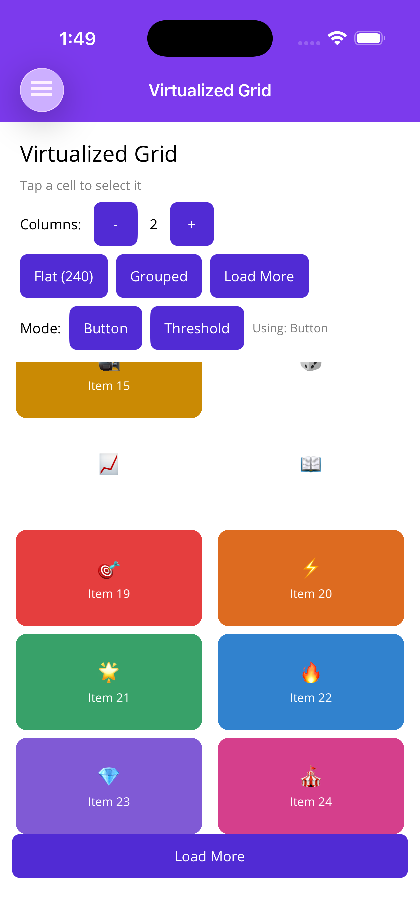 |
Blazor
| Flat grid | Grouped with sticky headers | Header, footer and load more |
|---|---|---|
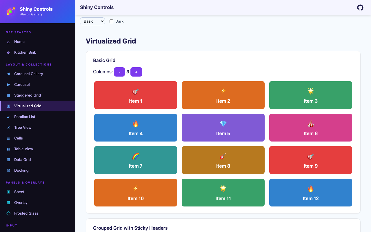 |
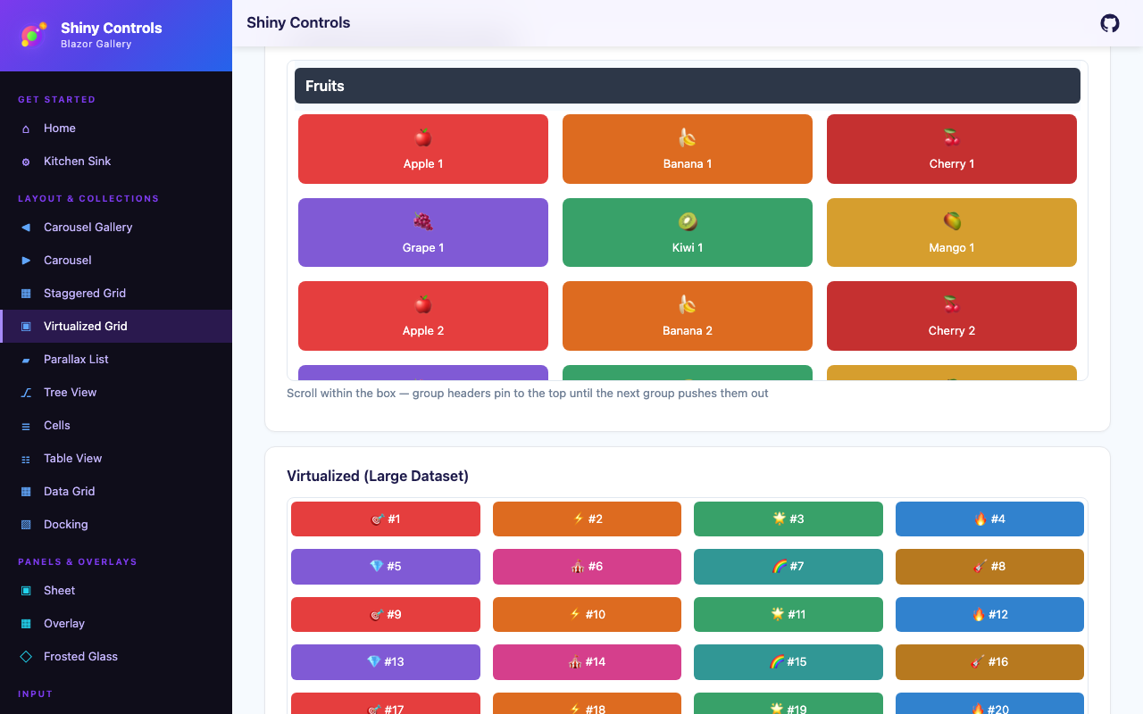 |
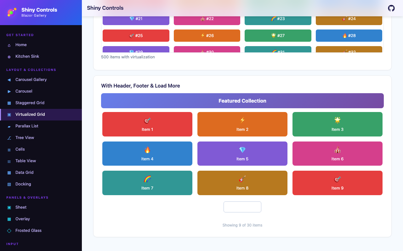 |
Features
Section titled “Features”- Virtualization – Native recycling on Android (
RecyclerView+GridLayoutManager), compositional layout on iOS (UICollectionViewCompositionalLayout), andItemsRepeater+UniformGridLayouton Windows. Blazor uses the built-in<Virtualize>component with CSS Grid. - Sticky Group Headers – When
IsGroupingEnabledistrue, group headers pin to the top of the viewport as the user scrolls through a group. - Orientation-Aware Columns – Set
PortraitColumnCountandLandscapeColumnCountindependently so the layout adapts automatically on device rotation. - Load-More Pagination – A
LoadMoreThresholdtriggersLoadMoreRequestedbefore the user reaches the last item; an optionalShowLoadMoreButtonrenders an explicit button for manual triggering. - Item Visibility Events –
ItemVisibleCommandandItemHiddenCommandfire as items enter and leave the viewport (MAUI). - Flexible Templates – Header, footer, empty view, group header, and load-more button are all fully templatable.
AI Skill
Section titled “AI Skill”Step 1 — Add the marketplace:
claude plugin marketplace add shinyorg/skillsStep 2 — Install the plugin:
claude plugin install shiny@shinyOne plugin installs all 35 Shiny skills. Your agent loads only the skill relevant to what you're building, so there's no cost to having them all available.
Step 1 — Add the marketplace:
copilot plugin marketplace add https://github.com/shinyorg/skillsStep 2 — Install the plugin:
copilot plugin install shiny@shinyOne plugin installs all 35 Shiny skills. Your agent loads only the skill relevant to what you're building, so there's no cost to having them all available.
Quick Start
Section titled “Quick Start”.NET MAUI
Section titled “.NET MAUI”<shiny:VirtualizedGrid ItemsSource="{Binding Products}" PortraitColumnCount="2" LandscapeColumnCount="4" IsGroupingEnabled="True" HasStickyHeaders="True" CellPadding="8" ShowLoadMoreButton="False" IsLoadingMore="{Binding IsLoadingMore}" ItemSelectedCommand="{Binding SelectProductCommand}"> <shiny:VirtualizedGrid.ItemTemplate> <DataTemplate> <Border StrokeShape="{RoundRectangle CornerRadius=8}" Padding="8"> <Label Text="{Binding Name}" /> </Border> </DataTemplate> </shiny:VirtualizedGrid.ItemTemplate> <shiny:VirtualizedGrid.GroupHeaderTemplate> <DataTemplate> <Label Text="{Binding Key}" FontAttributes="Bold" FontSize="16" /> </DataTemplate> </shiny:VirtualizedGrid.GroupHeaderTemplate></shiny:VirtualizedGrid>Blazor
Section titled “Blazor”<VirtualizedGrid Items="products" ColumnCount="2" ItemSpacing="8" IsGroupingEnabled="true" HasStickyHeaders="true" EnableVirtualization="true" LoadMoreThreshold="5" IsLoadingMore="isLoadingMore" LoadMoreRequested="OnLoadMore" ItemSelected="OnProductSelected"> <ItemTemplate Context="product"> <div class="product-card"> <span>@product.Name</span> </div> </ItemTemplate> <GroupHeaderTemplate Context="group"> <h3>@group</h3> </GroupHeaderTemplate> <EmptyViewTemplate> <p>No products found.</p> </EmptyViewTemplate></VirtualizedGrid>
@code { List<Product> products = []; bool isLoadingMore = false;
async Task OnLoadMore() { isLoadingMore = true; // fetch next page... isLoadingMore = false; }
void OnProductSelected(Product product) { }}Properties
Section titled “Properties”| Property | Type | Default | Description |
|---|---|---|---|
| ItemsSource | IEnumerable | – | Collection of items or grouped collections |
| ItemTemplate | DataTemplate | – | Template for each grid cell |
| ColumnCount | int | 1 | Default column count |
| PortraitColumnCount | int? | null | Column count in portrait orientation; overrides ColumnCount |
| LandscapeColumnCount | int? | null | Column count in landscape orientation; overrides ColumnCount |
| CellPadding | Thickness | – | Padding applied inside each cell |
| IsGroupingEnabled | bool | false | Enable grouped data with group headers |
| GroupHeaderTemplate | DataTemplate | – | Template for group header rows |
| HasStickyHeaders | bool | true | Pin group headers to the top while scrolling |
| ShowLoadMoreButton | bool | false | Render an explicit load-more button as a footer at the end of the data |
| LoadMoreButtonTemplate | DataTemplate | – | Custom template for the load-more button; defaults to a centered “Load More” button |
| IsLoadingMore | bool | false | Indicates a load-more operation is in progress |
| ItemSelectedCommand | ICommand | – | Command fired when a cell is tapped |
| ItemVisibleCommand | ICommand | – | Command fired when a cell enters the viewport |
| ItemHiddenCommand | ICommand | – | Command fired when a cell leaves the viewport |
Blazor
Section titled “Blazor”| Property | Type | Default | Description |
|---|---|---|---|
| Items | IReadOnlyList<TItem> | – | Flat list of items |
| ItemTemplate | RenderFragment<TItem> | – | Template for each grid cell |
| HeaderTemplate | RenderFragment | – | Content rendered above the grid |
| FooterTemplate | RenderFragment | – | Content rendered below the grid |
| EmptyViewTemplate | RenderFragment | – | Content rendered when Items is empty |
| ColumnCount | int | 1 | Number of grid columns |
| ItemSpacing | double | 8 | Gap between cells in px |
| CellPaddingLeft | double | – | Left padding inside each cell |
| CellPaddingRight | double | – | Right padding inside each cell |
| CellPaddingTop | double | – | Top padding inside each cell |
| CellPaddingBottom | double | – | Bottom padding inside each cell |
| IsGroupingEnabled | bool | false | Enable grouped rendering |
| GroupedItems | IReadOnlyList<VirtualizedGridGroup<TItem>> | – | Pre-grouped data source used when IsGroupingEnabled is true |
| GroupHeaderTemplate | RenderFragment<object> | – | Template for group header rows |
| HasStickyHeaders | bool | true | Pin group headers while scrolling |
| EnableVirtualization | bool | false | Use Blazor <Virtualize> for large datasets |
| LoadMoreThreshold | int | 5 | Number of items from the end that triggers LoadMoreRequested |
| ShowLoadMoreButton | bool | false | Render an explicit load-more button |
| IsLoadingMore | bool | false | Indicates a load-more operation is in progress |
| LoadMoreRequested | EventCallback | – | Fired when the threshold is reached or the load-more button is clicked |
| ItemSelected | EventCallback<TItem> | – | Fired when a cell is clicked/tapped |
Events & Commands
Section titled “Events & Commands”MAUI:
ItemSelectedCommand(ICommand) – Fires on cell tap; parameter is the selected itemItemVisibleCommand(ICommand) – Fires as a cell scrolls into the visible areaItemHiddenCommand(ICommand) – Fires as a cell scrolls out of the visible area
Blazor:
LoadMoreRequested(EventCallback) – Fires when proximity threshold is reached or load-more button is pressedItemSelected(EventCallback<TItem>) – Fires on cell click/tap
Behavior
Section titled “Behavior”- When both
PortraitColumnCountandLandscapeColumnCountare set,ColumnCountis ignored and the appropriate value is chosen based on current device orientation - Sticky headers require
IsGroupingEnabled="true"; settingHasStickyHeaders="false"renders standard (non-sticky) group headers LoadMoreThresholdcounts from the last item; reaching that position firesLoadMoreRequestedautomatically even withoutShowLoadMoreButton- Setting
IsLoadingMore="true"shows a built-in activity indicator in the load-more area until the value returns tofalse EnableVirtualizationin Blazor requiresItemsto be provided as a flat list; useGroupedItemsalongsideIsGroupingEnabledfor grouped virtualized rendering