


Toolbar & TabBar (Blazor Only)
Two screen-docked navigation chromes for Blazor:
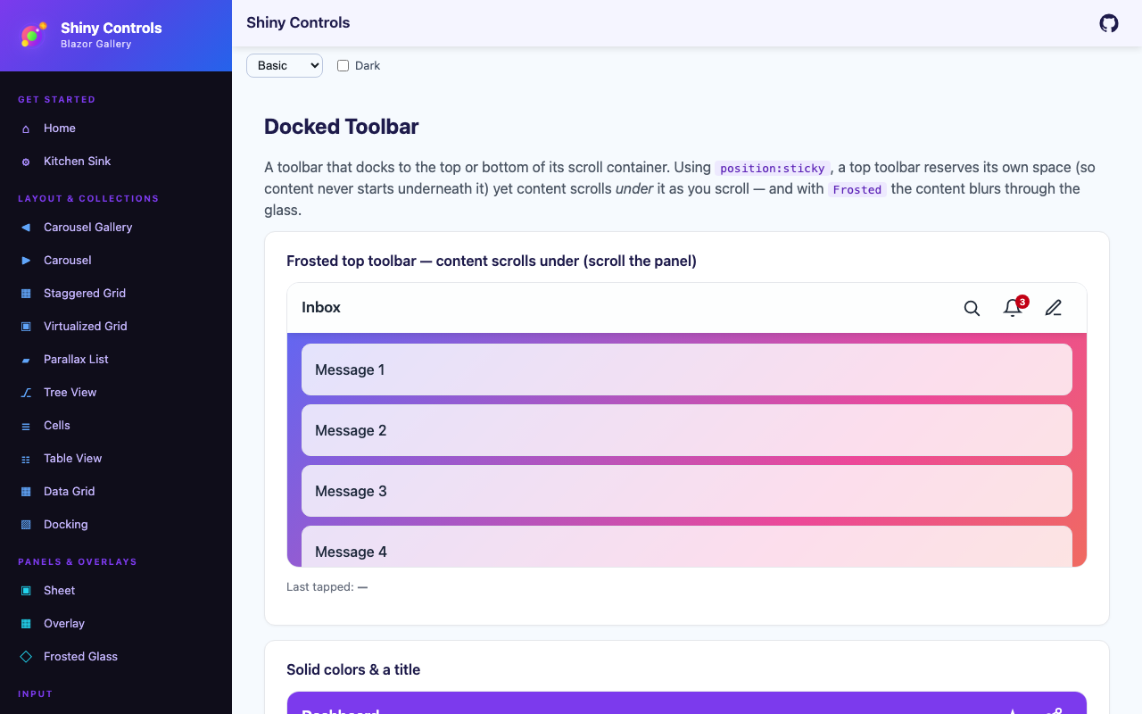
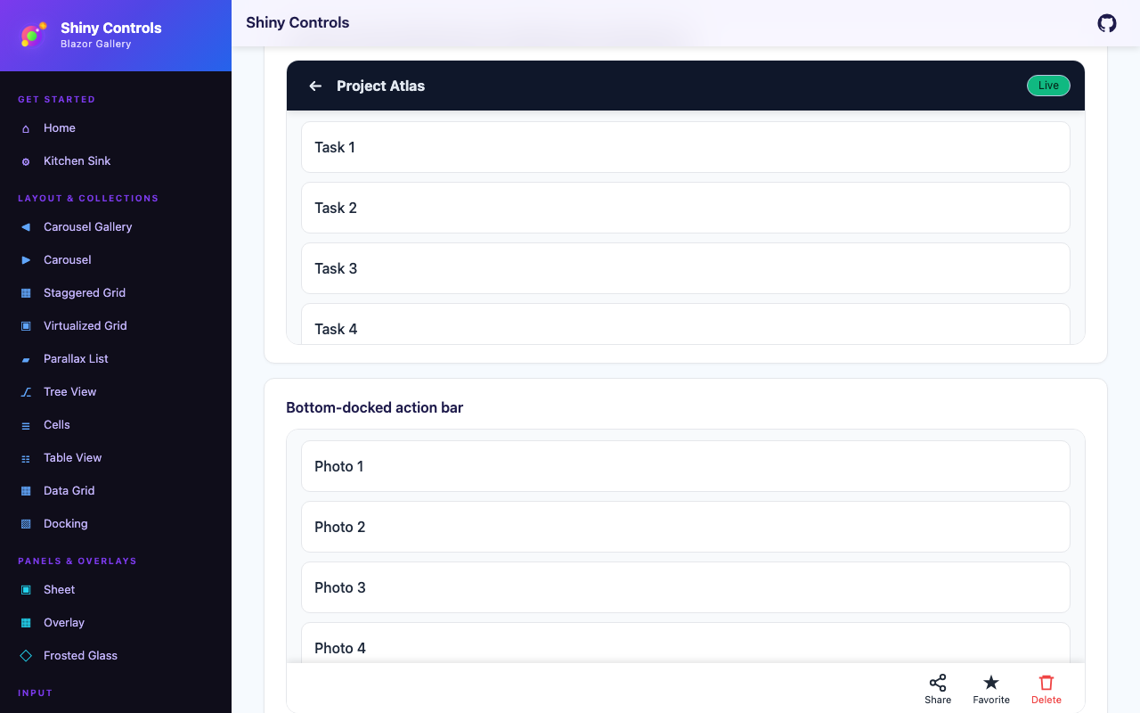
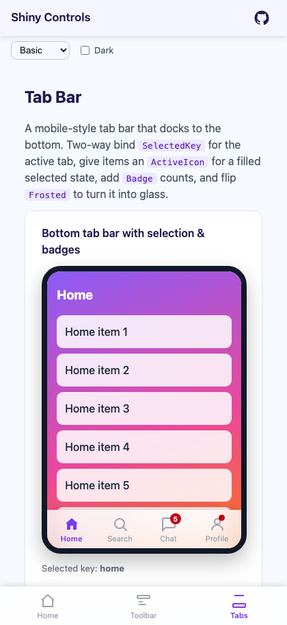
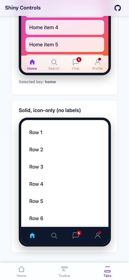
ShinyToolbardocks to the top or bottom of its scroll container as an action bar (icons with links/actions, a title, and custom content slots) — trailing actions that don’t fit collapse into a hamburger overflow menu automatically, and any action can carry a dropdown with nested submenus.ShinyTabBaris a mobile-style tab bar pinned to the bottom of the viewport with a selected state, optional filled active icons, and badges.
Both support a frosted-glass toggle backed by CSS backdrop-filter. The top toolbar uses position: sticky, so it reserves its own height — content never starts underneath it — yet page content scrolls under it as you scroll, producing the classic translucent-header effect. The tab bar uses position: fixed, so it stays pinned regardless of scroll.

| Toolbar with title | Toolbar custom content | Tab bar with badges | Icon-only tab bar |
|---|---|---|---|
 |
 |
 |
 |
@using Shiny.Blazor.ControlsNo service registration is required — both are plain Razor components.
Placement & scroll-under
Section titled “Placement & scroll-under”position: sticky sticks relative to the nearest scroll container, and any ancestor with overflow: hidden silently breaks it — use overflow: clip if you must clip an axis. The toolbar’s dropdowns are unaffected either way: they are drawn in the browser’s top layer, so nothing on the page clips them.
For app-wide chrome, place ShinyToolbar as the first element of your page/layout scroll area and drop ShinyTabBar anywhere (it’s Fixed). A common responsive pattern is a sidebar on desktop that gives way to a bottom ShinyTabBar on narrow viewports:
<main class="content">    <ShinyToolbar Dock="ToolbarDock.Top" Frosted="true" Title="My App" />
    <div class="content-inner">        @Body    </div>
    <ShinyTabBar CssClass="mobile-tabbar" Items="@tabs" SelectedKey="@CurrentKey" /></main>
/* hidden on desktop; shown on narrow screens (::deep reaches the child component root) */.content ::deep .mobile-tabbar { display: none; }
@media (max-width: 820px) { .sidebar { display: none; } .content ::deep .mobile-tabbar { display: block; } .content-inner { padding-bottom: calc(56px + env(safe-area-inset-bottom) + 16px); }}AI Skill
Section titled “AI Skill”Step 1 — Add the marketplace:
claude plugin marketplace add shinyorg/skillsStep 2 — Install the plugin:
claude plugin install shiny@shinyOne plugin installs all 35 Shiny skills. Your agent loads only the skill relevant to what you're building, so there's no cost to having them all available.
Step 1 — Add the marketplace:
copilot plugin marketplace add https://github.com/shinyorg/skillsStep 2 — Install the plugin:
copilot plugin install shiny@shinyOne plugin installs all 35 Shiny skills. Your agent loads only the skill relevant to what you're building, so there's no cost to having them all available.