


Document Editor


Two controls, on both hosts:
| Control | What it is |
|---|---|
DocumentEditor |
the lone editing surface — canvas, caret, selection, typing. No chrome. |
DocumentEditorView |
DocumentEditor plus a formatting toolbar |
Same packages as the viewers (Shiny.Maui.Controls.Office / Shiny.Blazor.Controls.Office), same two
constraints: MAUI needs UseShinyOffice() (it registers SkiaSharp, plus the Skia canvas SkiaSharp does not ship for the macOS AppKit head), Blazor is WASM-only, and on Blazor the container needs
an explicit height.
Open a document for editing
Section titled “Open a document for editing”editable: true is required — a read-only document throws on any edit.
using var document = await WordDocument.OpenAsync("report.docx", editable: true);Blazor
Section titled “Blazor”<div style="height:520px"> <DocumentEditorView Document="document" DocumentChanged="OnChanged" /></div>
@* or the bare surface, with your own chrome: *@<div style="height:520px"> <DocumentEditor @ref="editor" Document="document" /></div><office:DocumentEditorView x:Name="Editor" Document="{Binding Document}" /><office:DocumentEditor x:Name="BareEditor" Document="{Binding Document}" />The toolbar is composed from what each host has
Section titled “The toolbar is composed from what each host has”Both hosts fill the same slots with the same core controls — FontPickerButton,
FontSizePickerButton and ColorPickerButton exist on MAUI and Blazor. Only the bar around them
differs:
- MAUI has no toolbar control, so
DocumentEditorViewbuilds a scrolling row of MAUI primitives and drops the pickers into it. Do not emitshiny:ShinyToolbarin XAML. - Blazor composes
ShinyToolbar, with the row inside it as its own flex container.
The API and behaviour match on both; only the internals differ.
One icon set, no colour
Section titled “One icon set, no colour”Every plain button on the Word and PowerPoint toolbars, on both hosts, draws from a single
monochrome stroked icon set defined once in Shiny.Controls.Office.Shared — a 24x24 grid at one
weight. MAUI paints it onto a GraphicsView; Blazor writes it out as inline SVG stroked in
currentColor. There is one definition of each mark, so the two hosts cannot drift.
What that replaced was a mixture: styled letters for bold and italic, geometric unicode for the alignment and undo controls, and emoji for the picture and delete buttons. The emoji are the reason it had to change rather than a matter of taste — a font paints them in its own colour, size and weight, so those two buttons could not be tinted, did not dim with a disabled button and looked different on every platform. Geometric unicode has the milder form of the same problem, plus tofu on Android fonts that lack the character.
The geometry is stored as drawing commands, not an SVG path string. MAUI’s PathBuilder has real
gaps parsing a d attribute — implicit line-tos become move-tos, run-together decimals truncate — and
it throws nothing, so artwork authored as a path string can look perfect in a browser and draw a stump
on a device. Neither host parses anything here.
The pickers are the deliberate exception: font, font size, text colour and the highlight swatch
have to show what they are currently set to, which is the one thing a monochrome icon cannot do. The
highlight split button keeps the shared A-over-a-bar mark and tints only the bar with the colour it
would apply.
Icon-only buttons get a tooltip on desktop and web
Section titled “Icon-only buttons get a tooltip on desktop and web”Every button on these bars is icon only, so each is wrapped in Shiny’s own
Tooltip naming what it does — the browser’s title is slow to appear, cannot be
themed and is unreachable from a keyboard.
- Blazor — on by default.
ShowToolbarTooltips="false"falls back to the nativetitle. - MAUI — on for desktop only: Windows, Mac Catalyst, macOS and the GTK/plain-.NET head. Off on iOS and Android, because the tooltip opens on hover and there is no hover on a touch screen; a long-press tooltip would compete with the tap the button exists for.
<DocumentEditorView Document="document" ShowToolbarTooltips="false" /><office:DocumentEditorView Document="{Binding Document}" ShowToolbarTooltips="True" />Both hosts always set an accessible name on the button — aria-label on Blazor,
SemanticProperties.Description on MAUI — whatever the tooltip setting is. A tooltip is not what a
screen reader reads.
Driving it
Section titled “Driving it”Everything lives on the shared controller, identical on both hosts:
var c = editor.Controller;          // DocumentEditorController
c.InsertText("hello");c.InsertParagraph();                 // Enterc.DeleteBackward();                  // Backspacec.Move(CaretMove.WordRight, extend: true);c.SelectAll();
c.ToggleBold(); c.ToggleItalic(); c.ToggleUnderline(); c.ToggleStrikethrough();c.SetFontFamily("Cambria");c.SetFontSize(14);                   // pointsc.SetTextColor(new ArgbColor(255, 0xC0, 0, 0));c.SetAlignment(TextAlignment.Center);
c.ToggleBulletList(); c.ToggleNumberedList();c.ChangeListLevel(1);                // nest a list item; -1 un-nestsc.HandleTab(shift: false);           // what the Tab key does, wherever the caret is
c.Undo(); c.Redo();c.CaretFormat;                       // what a toolbar should show as activec.Selection.Range;
Lists have a page of their own — nesting, the compounding 1a labels, and what typing - does:
Bulleted & Numbered Lists.
Saving is the same as everywhere else — and an unedited document still saves byte-identical:
await document.SaveAsAsync("edited.docx");Page margins
Section titled “Page margins”The document’s own margins, set for the whole document and undoable in one step:
c.PageMargins; // what it is set to now, pixels at 96dpic.SetPageMargins(PageMargins.Narrow); // Normal / Narrow / Moderate / Widec.SetPageMargins(PageMargins.FromInches(1, 1.25, 1, 1.25)); // left, top, right, bottomc.SetPageMargins(left: 96, top: 96, right: 96, bottom: 96); // pixels; header/footer distances keptBoth toolbars carry a page-margins button — an action sheet on MAUI, a popover on Blazor — offering
Word’s four presets, with the one the document already matches marked. That gallery is
PageMarginPresets.All (name, description, margins) in Shiny.Controls.Office.Shared, so the two
hosts cannot drift; use it rather than a list of your own.
PageMargins also carries Header and Footer: the distance from the page edge to the header and
footer, which sit inside the top and bottom margins rather than adding to them — which is why a
header can appear without moving the body text at all. PageSetup.Margins reads them off an open
document and PageSetup.WithMargins writes them onto a copy.
Two things worth knowing:
- Only
DocumentPageLayout.Printcan show it. A reflowed column has no paper to inset content from, so it keeps its cosmetic gutter. The change is still written to the document and still saved, exactly as a page break is — it simply has nowhere to appear until the view is showing pages. - Undo is total. The whole
w:pgMarelement is captured before the write, so a document that never had one goes back to not having one, and anything else it carried — a binding gutter above all — survives.
Keyboard input
Section titled “Keyboard input”Blazor: complete. Typing goes through beforeinput, so IME composition, autocorrect, dictation and
paste all work. Arrows, Home/End, Ctrl/Cmd+B/I/U, Ctrl/Cmd+Z and Shift+Ctrl/Cmd+Z are wired.
MAUI: typing works — a hidden Entry gives the platform keyboard and IME somewhere to send text.
Physical keys do not, because MAUI exposes no portable key-down event. Route them yourself:
Editor.HandleKey(EditorKey.Left, shift: true);Editor.HandleKey(EditorKey.Undo, control: true);A desktop host adds its own platform hook (NSEvent on macOS, KeyDown on Windows) and calls that.
Tapping, selection, typing and every toolbar command work without it.
Home ▸ Find carries a box, a 3/12 readout and a pair of arrows. Typing searches as you type and
selects the first hit at or after the caret; the arrows walk the rest and wrap at either end. Paragraphs
only — a caret position is a block and an offset, and a table cell has neither. See
Find in Office Documents.
Spell check
Section titled “Spell check”On by default, and on MAUI the checker is the platform’s own:
| Platform | Checker |
|---|---|
| iOS, Mac Catalyst | UITextChecker |
| macOS (AppKit) | NSSpellChecker |
| Android | SpellCheckerSession via text services |
| Windows | ISpellChecker (COM) |
| Blazor / plain .NET | none — supply one |
Nothing has to be registered: referencing Shiny.Maui.Controls.Office installs it. Using the
platform’s checker rather than shipping a dictionary is the point — it is the user’s dictionary, so
words they have already taught their keyboard are known, and Add to dictionary writes back to it
and is shared with every other app on the device.
Misspellings get a red wavy underline. Right-click, or long-press on touch, for the corrections along with Ignore and Add to dictionary. Applying a correction is a single undo step.
Blazor has to be given one
Section titled “Blazor has to be given one”The browser spell-checks its own editable elements and exposes neither the results nor the suggestions to script — and a canvas is not an editable element in the first place. So there is nothing to call, and Blazor defaults to no checking:
<DocumentEditorView Document="document" SpellChecker="myChecker" SpellCheckEnabled="true" />Supplying your own
Section titled “Supplying your own”Derive from SpellCheckerBase — it already handles the ignore list and language defaulting, leaving
two methods:
public sealed class MyChecker : SpellCheckerBase{    public override bool IsAvailable => true;
    protected override ValueTask<IReadOnlyList<SpellingError>> CheckCoreAsync(        string text, string language, CancellationToken cancellationToken) => ...;
    protected override ValueTask<IReadOnlyList<string>> SuggestCoreAsync(        string word, string language, CancellationToken cancellationToken) => ...;}
Then per control (SpellChecker), or globally, before the first editor is constructed:
SpellCheckers.Default = new MyChecker();Registration uses SetDefaultIfUnset, so an explicit choice always wins and the platform checker is
never even constructed.
SpellingTokenizer is public and worth reusing: it skips acronyms, camelCase, numbers, URLs, email
addresses and paths — the things every dictionary flags and no reader wants underlined.
- Checking is per paragraph, cached on the paragraph’s text, and limited to the paragraphs on screen. Scrolling re-checks nothing already seen; editing re-checks one paragraph.
- Calls are debounced by 500 ms. A platform checker is interop — a service round trip on Android — and a half-typed word is not a mistake.
- ⚠️
IsAvailableis false when there is no checker or no dictionary for the language. Check it before telling a user spelling is on. - Set
SpellCheckEnabled/IsSpellCheckEnabledtofalseto turn it off entirely.
Not implemented
Section titled “Not implemented”- Formatting with an empty selection changes only
CaretFormat, not the document. Word applies it to whatever is typed next; that needs a pending-format concept the editor does not have yet. - Editing tables, images, lists (their text edits fine; structure does not).
- Cut/copy/paste through the clipboard, find and replace.
- Grammar checking. Android reports grammar errors and they are deliberately ignored, so all four platforms behave the same.
- Inserting new paragraph styles, images or tables.
- Setting the paper size or orientation — the margins can be set, the sheet they sit on cannot.
- Per-section page setup. One geometry is read for the document and one is written back, so the margins are the last section’s.
- Everything the viewer does not render is still not rendered — see
document-viewer.md.
Screenshots
Section titled “Screenshots”| MAUI | Blazor |
|---|---|
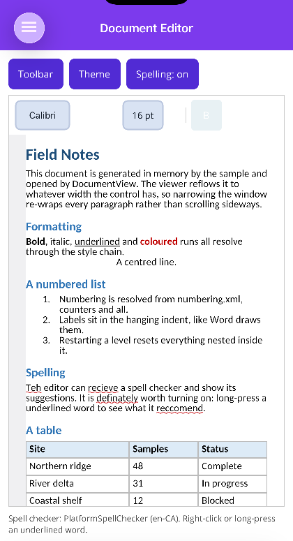 |
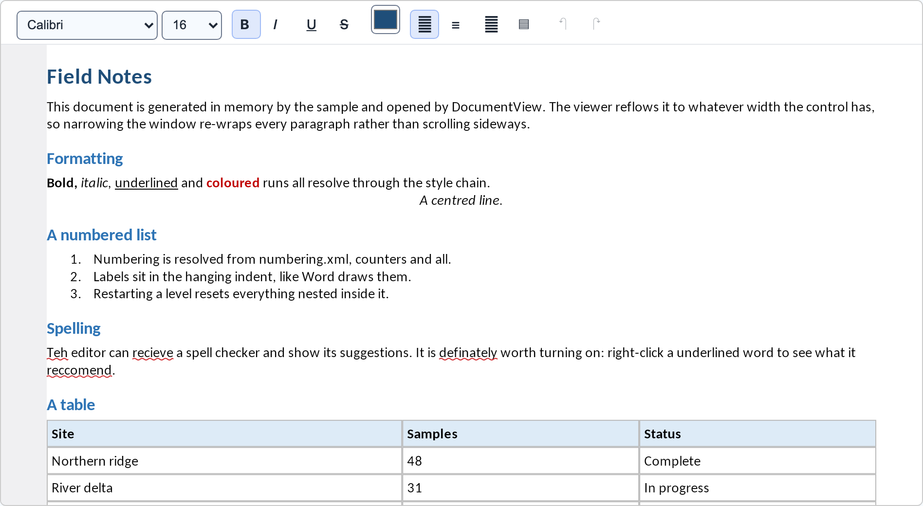 |
The MAUI shot is running the platform spell checker — UITextChecker on iOS, registered with no
setup — which is why the misspellings are underlined.