


Theming
Shiny Controls ship a central, Material 3 style theming system shared by MAUI and Blazor. A theme is a set of design tokens — color roles, shape, elevation, typography, density, borders, state and spacing. The core packages define the token contract and a built-in Basic theme; additional themes (Ocean, Material, Terminal, Aurora) install as separate NuGet packs.
Screenshots
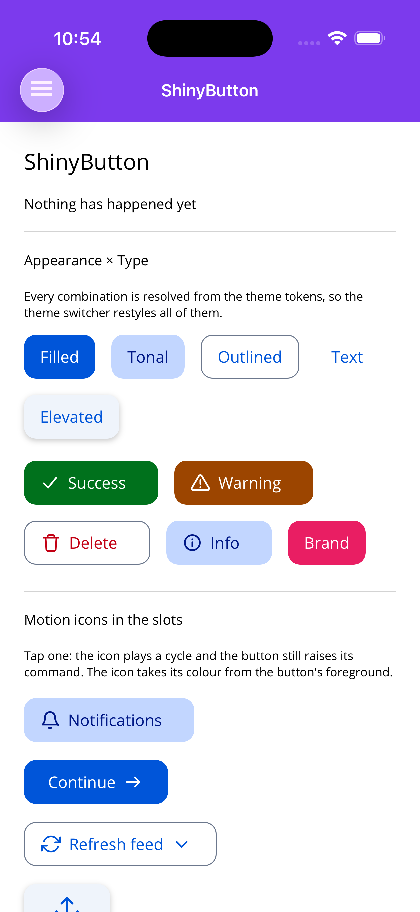
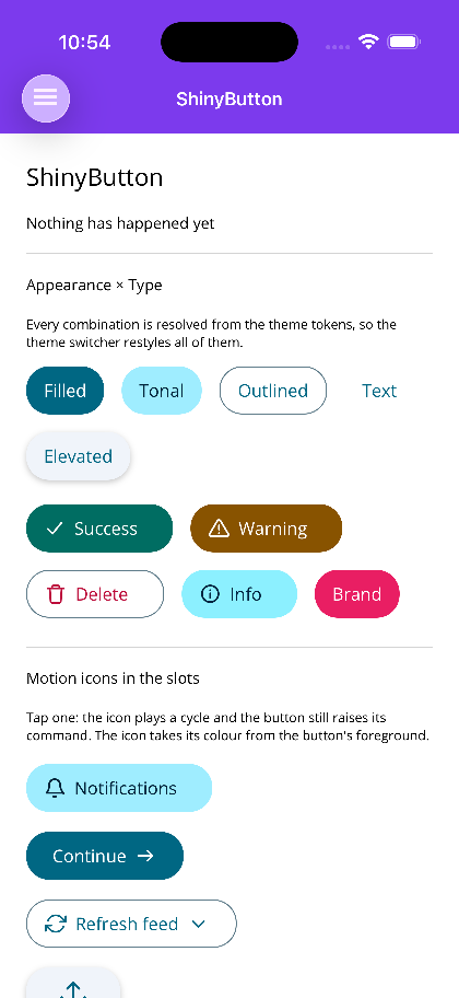
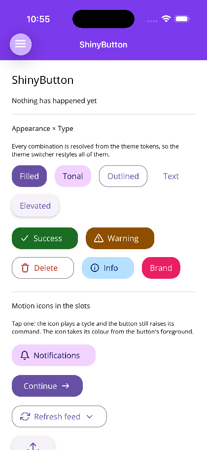
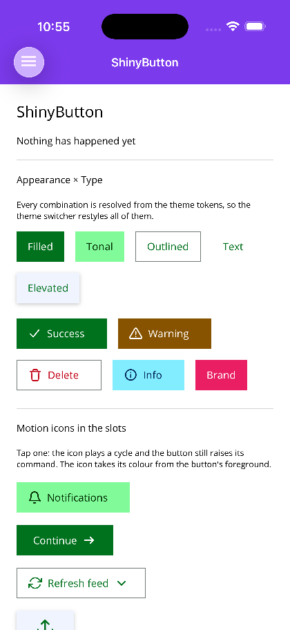
Section titled “Screenshots”MAUI — the same ShinyButton page under all five packs. Nothing on it is styled by hand; every
colour comes from the tokens the installed pack defines.
| Basic | Ocean | Material | Terminal | Aurora |
|---|---|---|---|---|
 |
 |
 |
 |
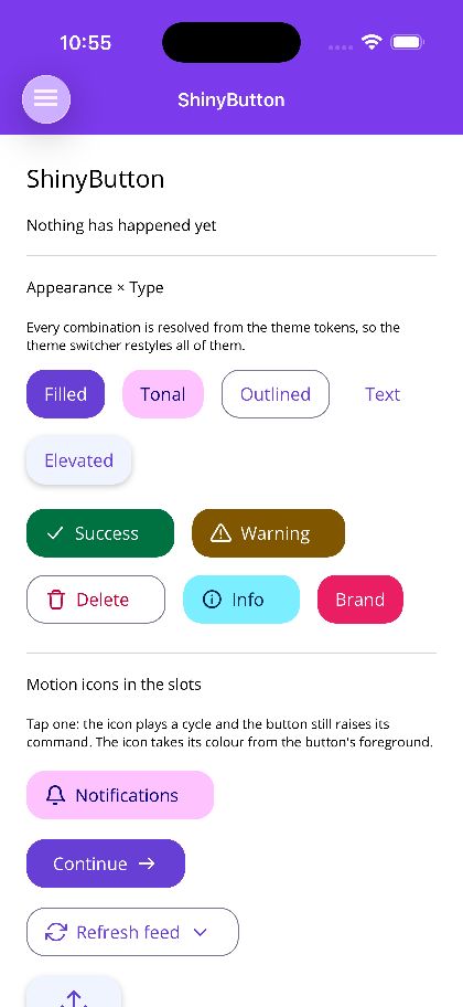 |
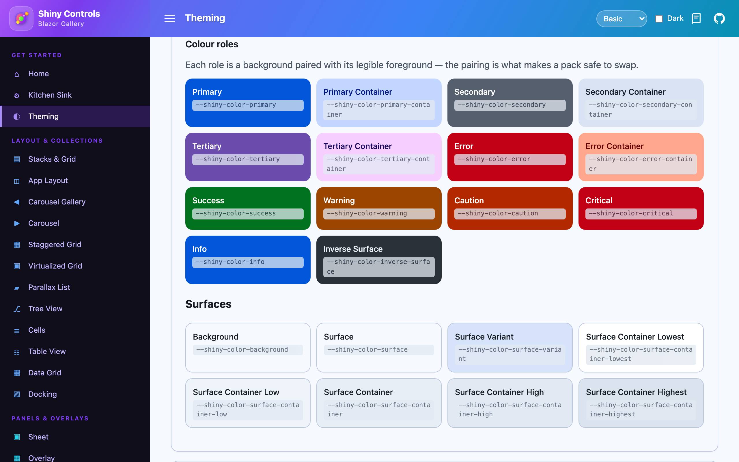
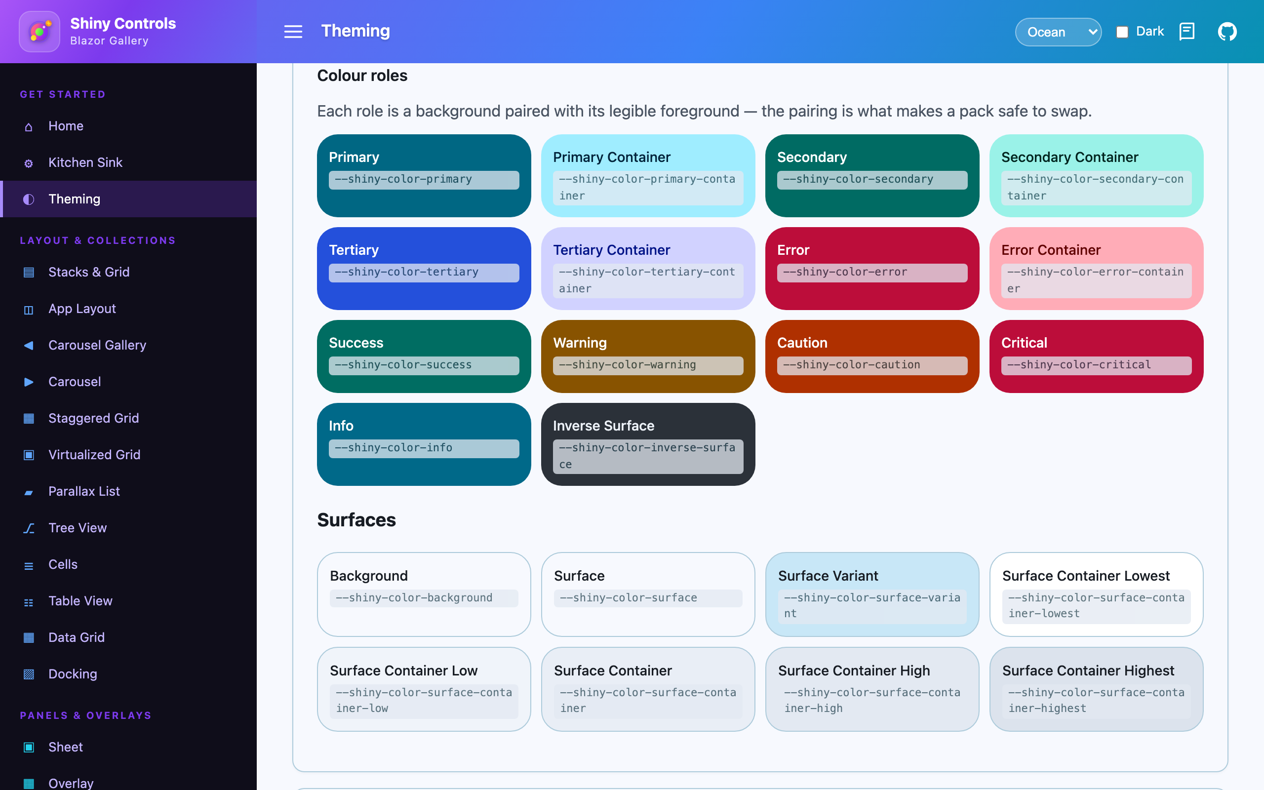
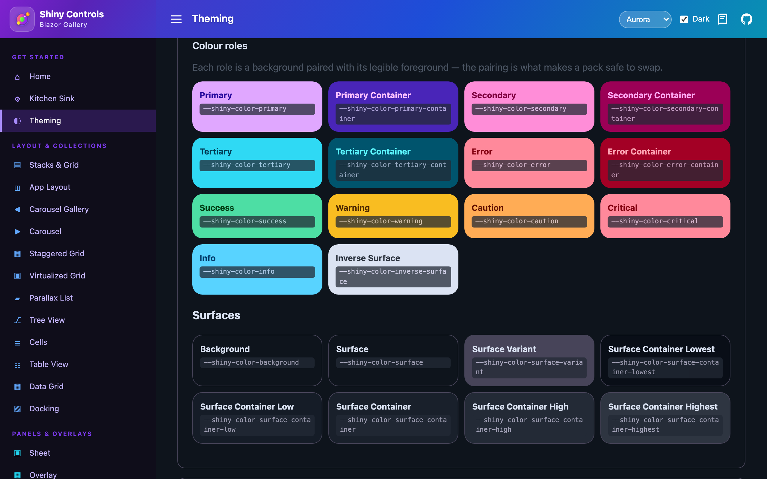
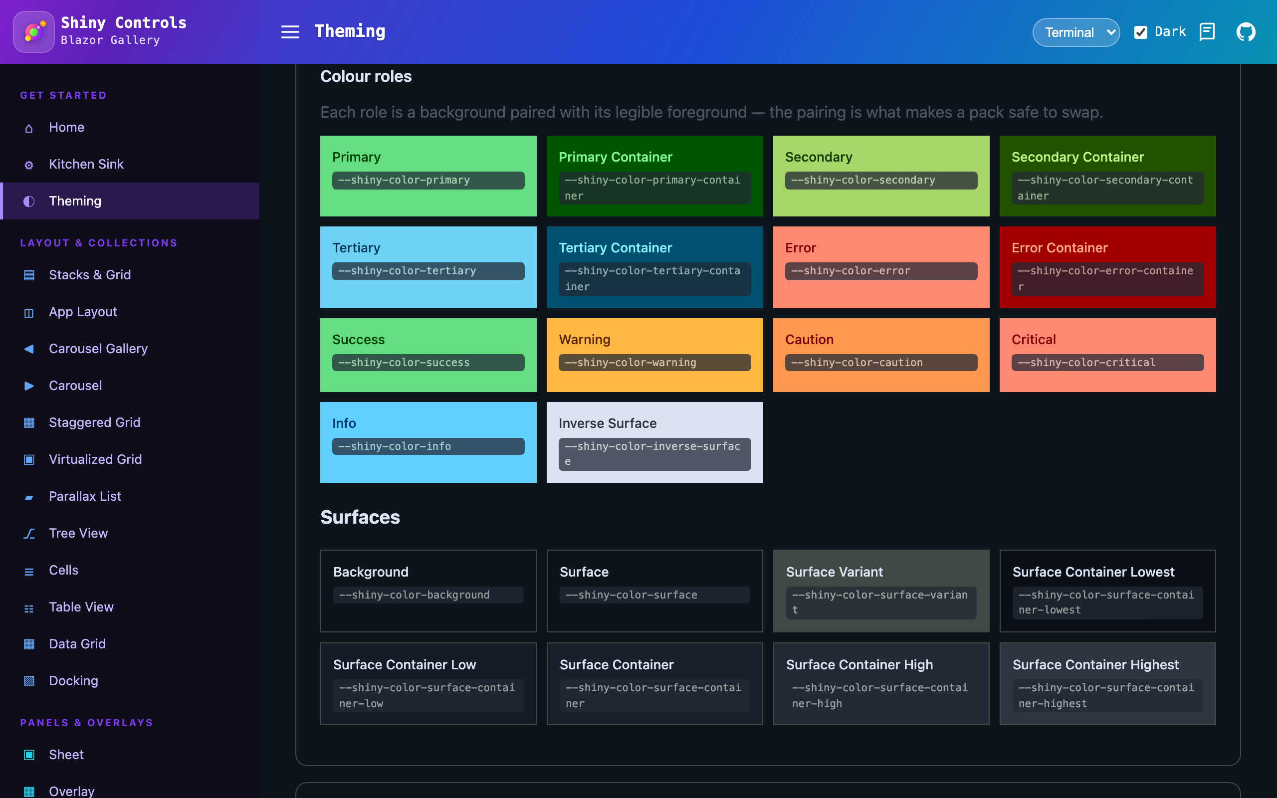
Blazor — the token gallery. The colour roles, and the same page after swapping the pack stylesheet and flipping to dark.
| Basic | Ocean | Aurora, dark | Terminal, dark |
|---|---|---|---|
 |
 |
 |
 |
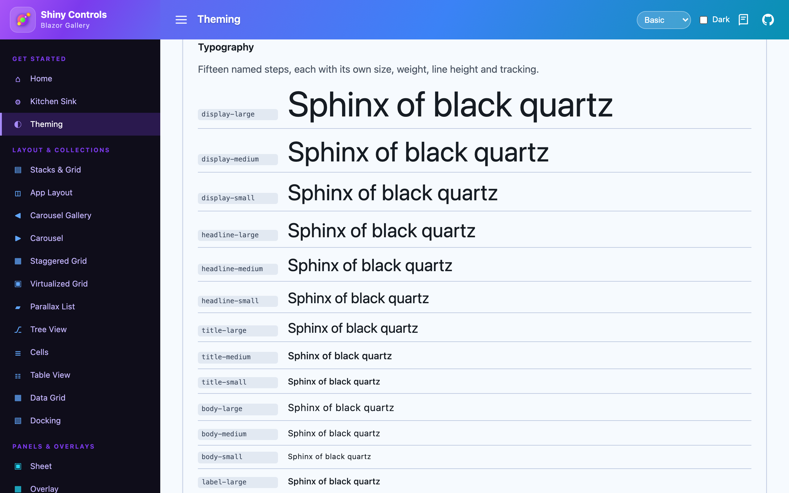
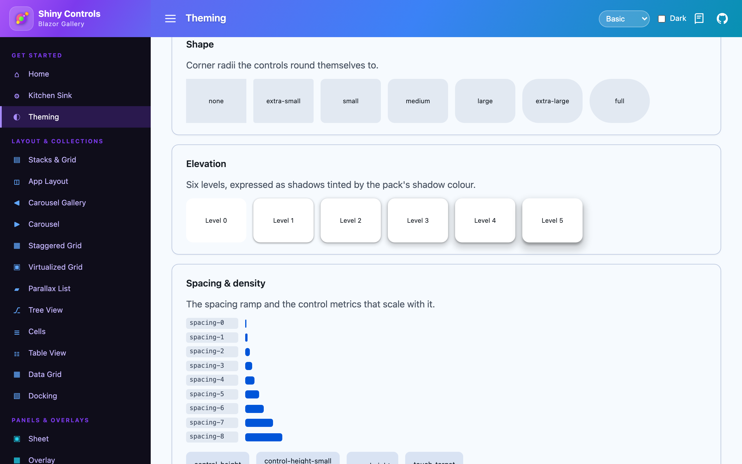
| Typography scale | Shape, elevation, spacing |
|---|---|
 |
 |
A theme is more than a palette
Section titled “A theme is more than a palette”Color alone cannot make two themes look genuinely different. The neutral ramp barely moves between packs — a tone-98 near-white has no room to carry a hue — so a palette-only theme leaves most controls looking identical and only the accents shift.
So a Shiny theme also defines its personality. Every block is optional; omit one and the shared default applies.
| Block | What it controls |
|---|---|
shape |
Corner geometry — a scale, or absolute corners overrides. The single biggest visual lever: square versus pillowy reads as a different framework before any color registers. |
typography |
fontFamily / displayFamily / monoFamily, scale, weightOffset, trackingOffset, lineHeightScale. |
elevation |
style — shadow, flat, outline or glow — plus intensity (how dark), softness (how large and diffuse) and tint. |
density |
A scale on the spacing ramp and control metrics, plus absolute controlHeight / controlHeightSmall / rowHeight. |
border |
The thin / medium / thick stroke ramp. |
state |
hover / focus / pressed / dragged layer opacities. |
intensity and softness are separate on purpose: “big soft halo at low opacity” and “tight dark
shadow” are different looks that a single knob collapses into one dim, shrunken shadow.
The built-in packs are picked to be visibly unalike:
| Pack | Personality |
|---|---|
| Basic | The neutral default, shipped in the core packages. |
| Material | M3 purple, Roboto, generously rounded, tonal shadows. |
| Ocean | Teal, soft pillowy corners, airy spacing, shadows you have to look for. |
| Terminal | Phosphor green, square, dense, monospace throughout, hairline rings instead of shadows. |
| Aurora | Violet/cyan, rounded, bold-weighted, and everything raised glows rather than casting a shadow. |
How it works
Section titled “How it works”A theme is described by ~11 seed colors plus the optional personality blocks above. From those, Shiny derives the full Material 3 tonal role set (light + dark) plus shape, border, elevation, density, type and spacing tokens, and emits platform assets:
- MAUI → C#
ResourceDictionaryclasses; controls bind colors withSetDynamicResource(…, ShinyThemeKeys.Color.X). - Blazor → a CSS file of
--shiny-*custom properties; controls referencevar(--shiny-color-x, <fallback>). The original value is kept as the fallback, so controls look correct even before a theme stylesheet is linked.
Swapping the theme restyles the entire control suite at once — including a live light/dark switch.
Using a theme — MAUI
Section titled “Using a theme — MAUI”Basic is applied automatically by UseShinyControls(). Install a pack and select it:
// dotnet add package Shiny.Maui.Controls.Themes.Oceanbuilder.UseShinyControls(cfg => cfg.UseOceanTheme());// or .UseMaterialTheme() / .UseTerminalTheme() / .UseAuroraTheme() / .UseBasicTheme()Switch at runtime — light/dark follows the OS automatically and hot-swaps:
ShinyThemeManager.SetTheme(new OceanTheme());Application.Current.UserAppTheme = AppTheme.Dark; // flips to the dark scheme liveExplicitly setting a control color (e.g. Fab.FabBackgroundColor) still overrides the theme.
Using a theme — Blazor
Section titled “Using a theme — Blazor”The core Basic stylesheet ships in Shiny.Blazor.Controls. Link it in index.html:
<link href="_content/Shiny.Blazor.Controls/css/shiny-theme.css" rel="stylesheet" />Install a pack and link its stylesheet after the core one (it overrides :root):
<!-- dotnet add package Shiny.Blazor.Controls.Themes.Ocean --><link href="_content/Shiny.Blazor.Controls.Themes.Ocean/css/shiny-theme-ocean.css" rel="stylesheet" />Dark mode follows the OS by default. Force it by adding shiny-theme-dark (or shiny-theme-light)
to <html> or any container — the tokens cascade to that subtree.
Token categories
Section titled “Token categories”| Category | Examples |
|---|---|
| Color (M3 roles) | primary, on-primary, primary-container, surface, on-surface, outline, … |
| Color (Shiny status) | success, info, warning, caution, critical (each with on- and -container) |
| Shape | corner-small (8), corner-medium (12), corner-large (16), corner-full |
| Border | border-thin, border-medium, border-thick |
| Elevation | elevation-0 … elevation-5 |
| State | hover-opacity, focus-opacity, pressed-opacity, dragged-opacity |
| Density | density-scale, density-control-height, density-row-height, density-touch-target |
| Type | font-family / -display / -mono, type-scale, and body-large, title-medium, label-small, … (size / line-height / weight / tracking) |
| Spacing | spacing-0 … spacing-8 (0, 4, 8, 12, 16, 24, 32, 48, 64 at density 1) |
The touch-target token is deliberately never scaled by density — shrinking the hit area below the platform minimum is an accessibility bug, not a design choice.
Authoring a new theme
Section titled “Authoring a new theme”- Use the Theme Creator, or copy
themes/basic.jsonand edit the seeds. - Add whichever personality blocks you want to differ.
themes/shiny-theme.schema.jsondocuments every field with its default, and editors complete it from the$schemareference at the top of each theme file. - Run
dotnet run --project tools/ShinyThemeGento regenerate both platforms. - For a new pack, add the two project files (model them on the Ocean pack) and register them in
Shiny.Controls.slnx/Build.slnf.