


ParallaxCollectionView
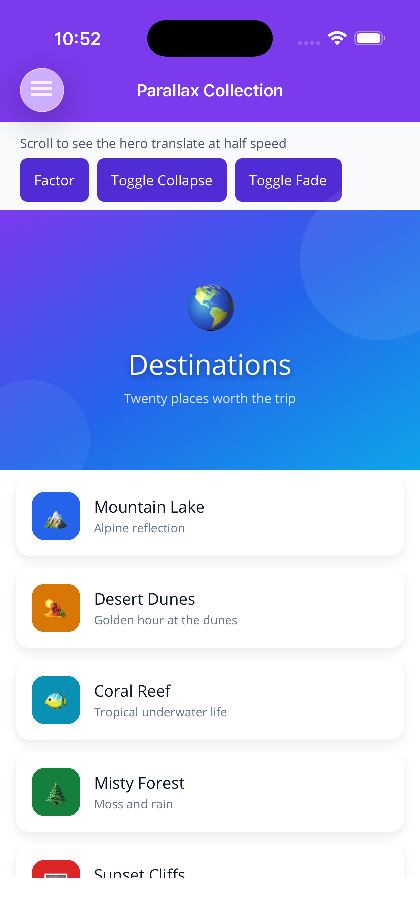
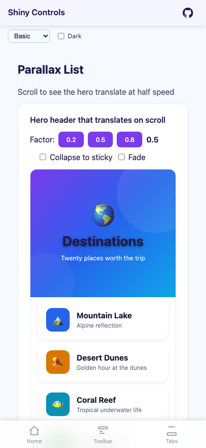
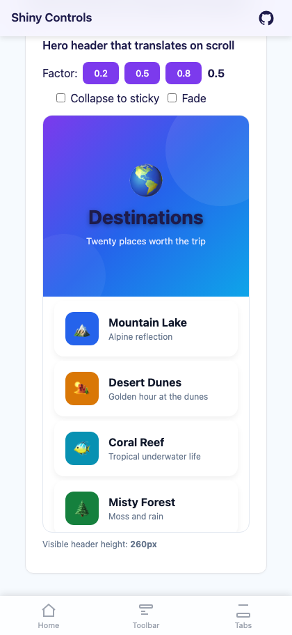
A scrollable collection with a hero header that translates at a configurable fraction of the scroll offset, producing the familiar “parallax” effect seen in app store and profile pages. Pure cross-platform implementation — no platform handlers on either host.
On MAUI the control is ParallaxCollectionView, a ContentView that wraps a real CollectionView plus a hero host and drives the translation from CollectionView.Scrolled. On Blazor it is ParallaxList<TItem>, a scrollable container with a JS scroll listener that mutates the hero transform directly (requestAnimationFrame-throttled) so the parallax runs at native scroll framerate without going through component re-renders.


MAUI
Blazor
| Hero header at rest | Header translated on scroll |
|---|---|
 |
 |
Features
Section titled “Features”- Hero header that translates on scroll — Set
HeaderTemplate(MAUI) /HeroTemplate(Blazor) to any view; it moves atParallaxFactor× scroll offset (default0.5= half speed). - Collapse to sticky — Enable
CollapseToStickywith a non-zeroMinHeaderHeightand the hero stops translating once it reaches the minimum height, leaving a sticky strip pinned at the top of the list. - Fade on scroll — Enable
FadeHeaderOnScrollto fade the hero out as it is scrolled past, useful when combining with a separate fixed title. - Real CollectionView underneath (MAUI) — Full
ItemTemplate/ItemTemplateSelector/EmptyView/SelectionMode/SelectedItem/ScrollTosupport; behaves like any MAUICollectionView. Scrolledevent — Both hosts emitParallaxScrollEventArgs(verticalOffset, headerTranslation, headerVisibleHeight)so you can drive secondary UI (a sticky title that appears once the hero collapses, a fading nav bar, etc.).- No platform code — MAUI uses only
CollectionView+Grid+ transforms. Blazor uses CSS + a tiny JS scroll listener (no Blazor render loop on scroll).
AI Skill
Section titled “AI Skill”Step 1 — Add the marketplace:
claude plugin marketplace add shinyorg/skillsStep 2 — Install the plugin:
claude plugin install shiny@shinyOne plugin installs all 35 Shiny skills. Your agent loads only the skill relevant to what you're building, so there's no cost to having them all available.
Step 1 — Add the marketplace:
copilot plugin marketplace add https://github.com/shinyorg/skillsStep 2 — Install the plugin:
copilot plugin install shiny@shinyOne plugin installs all 35 Shiny skills. Your agent loads only the skill relevant to what you're building, so there's no cost to having them all available.
Quick Start
Section titled “Quick Start”.NET MAUI
Section titled “.NET MAUI”<shiny:ParallaxCollectionView ItemsSource="{Binding Items}" HeaderHeight="260" MinHeaderHeight="96" ParallaxFactor="0.5" CollapseToSticky="True" FadeHeaderOnScroll="False" SelectionMode="Single" ItemSelectedCommand="{Binding ItemSelectedCommand}">
<shiny:ParallaxCollectionView.HeaderTemplate> <DataTemplate> <Grid> <Grid.Background> <LinearGradientBrush StartPoint="0,0" EndPoint="1,1"> <GradientStop Color="#7C3AED" Offset="0.0" /> <GradientStop Color="#2563EB" Offset="0.5" /> <GradientStop Color="#0EA5E9" Offset="1.0" /> </LinearGradientBrush> </Grid.Background> <Label Text="Destinations" FontSize="28" FontAttributes="Bold" TextColor="White" VerticalOptions="Center" HorizontalOptions="Center" /> </Grid> </DataTemplate> </shiny:ParallaxCollectionView.HeaderTemplate>
<shiny:ParallaxCollectionView.ItemTemplate> <DataTemplate> <Border Margin="16,6" Padding="16"> <Label Text="{Binding Title}" FontAttributes="Bold" /> </Border> </DataTemplate> </shiny:ParallaxCollectionView.ItemTemplate></shiny:ParallaxCollectionView>Blazor
Section titled “Blazor”<div style="height:600px;"> <ParallaxList TItem="DestinationItem" Items="@items" HeaderHeight="260" MinHeaderHeight="96" ParallaxFactor="0.5" CollapseToSticky="true" FadeHeaderOnScroll="false" ItemSelected="OnSelected" Scrolled="OnScrolled"> <HeroTemplate> <div style="height:100%;background:linear-gradient(135deg,#7C3AED,#2563EB,#0EA5E9); color:white;display:flex;align-items:center;justify-content:center; font-size:28px;font-weight:700;"> Destinations </div> </HeroTemplate> <ItemTemplate Context="item"> <div style="margin:6px 16px;padding:16px;background:white;border-radius:14px;"> <strong>@item.Title</strong> </div> </ItemTemplate> </ParallaxList></div>
@code { record DestinationItem(string Title); List<DestinationItem> items = []; void OnSelected(DestinationItem item) { } void OnScrolled(ParallaxScrollEventArgs e) { /* e.HeaderVisibleHeight, etc. */ }}Blazor: the
<ParallaxList>fills its parent. Place it in a container with a fixedheight(px, vh, etc.) so it has something to scroll inside.
Properties
Section titled “Properties”| Property | MAUI Type | Blazor Type | Default | Description |
|---|---|---|---|---|
| ItemsSource / Items | IEnumerable | IReadOnlyList<TItem> | – | Collection of items to display |
| ItemTemplate | DataTemplate | RenderFragment<TItem> | – | Template for each row |
| HeaderTemplate / HeroTemplate | DataTemplate | RenderFragment | – | Template for the parallax hero header |
| EmptyView / EmptyTemplate | object / DataTemplate | RenderFragment | – | Shown when the source is null or empty |
| HeaderHeight | double | double | 240 | Height of the hero header in px |
| MinHeaderHeight | double | double | 0 | Minimum visible height when CollapseToSticky is true |
| ParallaxFactor | double | double | 0.5 | Fraction of the scroll offset applied to the hero translation (0 = pinned, 1 = scrolls with content) |
| CollapseToSticky | bool | bool | false | When true, the hero stops translating at MinHeaderHeight and stays pinned |
| FadeHeaderOnScroll | bool | bool | false | Fade the hero from 100% → 0% opacity as it scrolls past |
| SelectionMode | SelectionMode | – | None | MAUI only — passthrough to inner CollectionView |
| SelectedItem | object | – | – | MAUI only — TwoWay selected item |
| ItemSelectedCommand | ICommand | – | – | MAUI only — fired on selection change |
| ItemSelected | – | EventCallback<TItem> | – | Blazor only — fired on row click |
| Height | – | string | – | Blazor only — CSS height for the scroll container; omit to fill parent |
Events
Section titled “Events”Both hosts fire a Scrolled event with ParallaxScrollEventArgs:
VerticalOffset— currentCollectionView/scroll-container scrollTop in pxHeaderTranslation— negative px translation currently applied to the hero (clamped ifCollapseToSticky)HeaderVisibleHeight— how many px of the hero are still visible (HeaderHeight + HeaderTranslation, floored atMinHeaderHeight)
Use this to drive a sticky title that appears once the hero is mostly hidden, fade a navigation chrome, or update progress indicators.
Behavior
Section titled “Behavior”- The hero is laid out at row 0 of the host grid (MAUI) / absolutely positioned at the top of the scroll container (Blazor). The list content sits below it via a transparent
CollectionViewheader (MAUI) or amargin-topmatchingHeaderHeight(Blazor), so items scroll over the hero when it has been pushed out of view. ParallaxFactor = 0pins the hero in place (no parallax).ParallaxFactor = 1makes the hero scroll with the content (no parallax). Use this if you want a normal scrolling header.ParallaxFactor = 0.5(default) gives a smooth half-speed effect that reads as parallax on most screens.CollapseToStickyrequiresMinHeaderHeight > 0to be meaningful — set both together.FadeHeaderOnScrollandCollapseToStickyare independent and can be combined: the hero collapses to its minimum height and then fades out.- MAUI: setting
ItemsLayout(e.g.<GridItemsLayout Span="2" />) on the control passes through to the innerCollectionView, so the list portion can be a multi-column grid while the hero stays full-width. - Blazor: the scroll listener runs in JS and updates
transform/opacityon the hero element directly usingrequestAnimationFrame, so 60 fps scroll behavior is preserved without re-rendering Razor components.
- Wrap the hero in a
Grid(MAUI) or<div>(Blazor) and use a gradientBackgroundor CSSbackgroundinstead of a static image — gradients render cheaply during the translation. - For the “sticky title that appears once the hero collapses” pattern, listen to
Scrolledand toggle the visibility of a separate header element whenHeaderVisibleHeightdrops below a threshold (e.g.MinHeaderHeight + 8). - If you need a multi-column grid of items under the hero, set
ItemsLayout(MAUI) to aGridItemsLayout. The hero remains a full-width header.