


Markdown
Render and edit markdown content using native controls — no WebView required on MAUI. Includes a read-only MarkdownView renderer and a full MarkdownEditor with formatting toolbar and live preview. Uses Markdig for parsing with support for tables, task lists, and more.


MAUI
| Viewer | Editor |
|---|---|
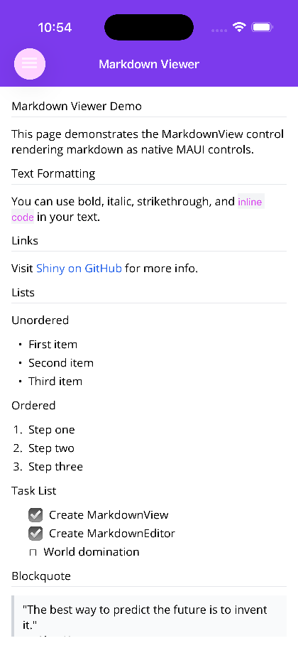 |
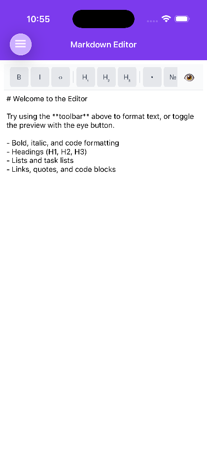 |
Blazor
| MarkdownView | MarkdownEditor with live preview |
|---|---|
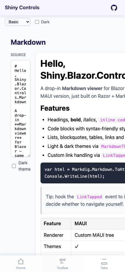 |
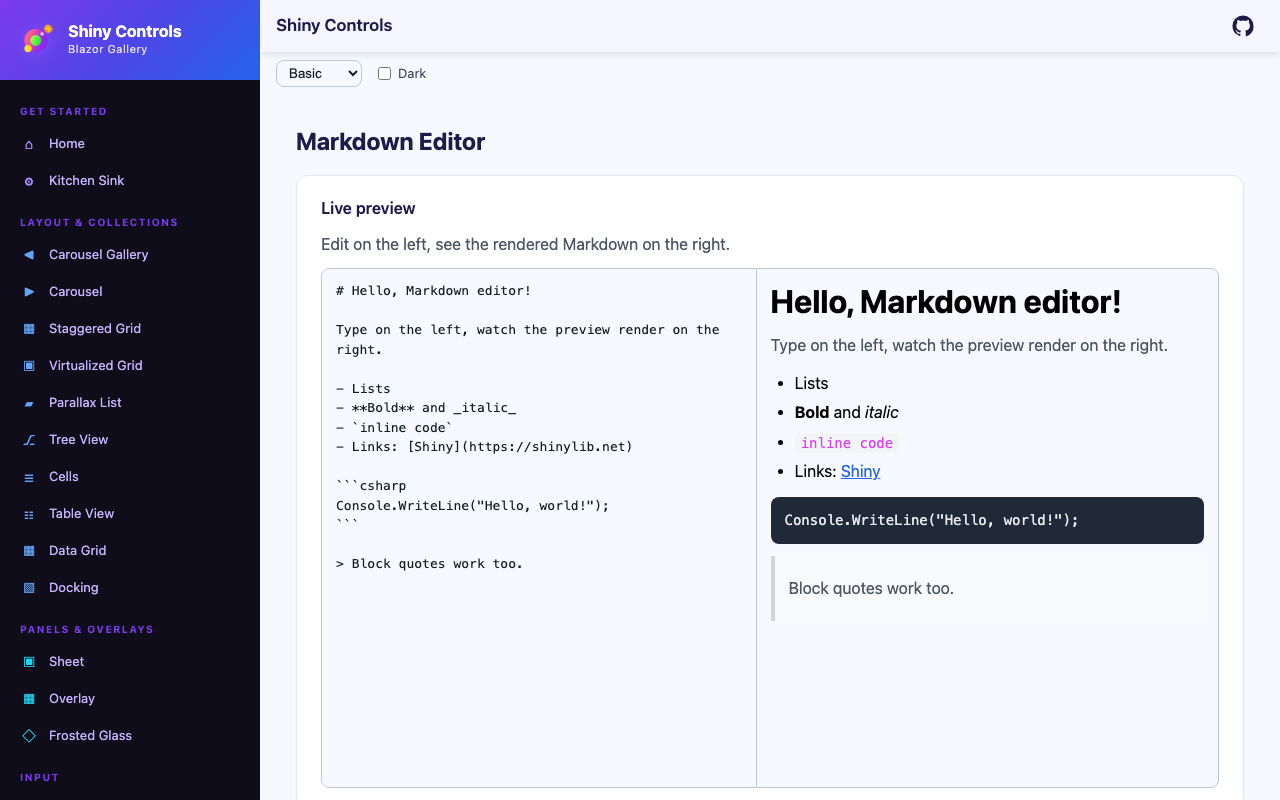 |
Add the XAML namespace:
xmlns:md="http://shiny.net/maui/markdown"MarkdownView
Section titled “MarkdownView”A read-only markdown renderer that converts markdown text to native MAUI controls.
<md:MarkdownView Markdown="{Binding DocumentContent}" Padding="16" />Properties
Section titled “Properties”| Property | Type | Default | Description |
|---|---|---|---|
Markdown |
string |
"" |
Markdown content to render |
Theme |
MarkdownTheme? |
null |
Rendering theme (auto Light/Dark if null) |
IsScrollEnabled |
bool |
true |
Enable/disable scrolling |
Events
Section titled “Events”| Event | EventArgs | Description |
|---|---|---|
LinkTapped |
LinkTappedEventArgs |
Fired when a link is tapped |
Handle links in code-behind:
markdownView.LinkTapped += (sender, args) =>{ if (args.Url.StartsWith("internal://")) { // Handle internal navigation args.Handled = true; // Prevents default browser launch }};MarkdownEditor
Section titled “MarkdownEditor”A full editor with formatting toolbar, live preview toggle, and customizable toolbar items.
<md:MarkdownEditor Markdown="{Binding NoteContent, Mode=TwoWay}" Placeholder="Start writing markdown..." Padding="8" />Properties
Section titled “Properties”| Property | Type | Default | Description |
|---|---|---|---|
Markdown |
string |
"" |
Markdown content (TwoWay) |
Theme |
MarkdownTheme? |
null |
Preview theme (auto Light/Dark if null) |
Placeholder |
string |
"Write markdown here..." |
Placeholder text |
ToolbarItems |
IReadOnlyList<MarkdownToolbarItem>? |
Default set | Formatting toolbar buttons |
IsPreviewVisible |
bool |
false |
Toggle preview pane (TwoWay) |
ToolbarBackgroundColor |
Color? |
null |
Toolbar background |
EditorBackgroundColor |
Color? |
null |
Editor background |
ShowToolbarInKeyboard |
bool |
true |
Repeat ToolbarItems on the soft keyboard’s accessory bar (MAUI iOS/Android) |
Accessory |
KeyboardAccessoryView? |
null |
Your own accessory bar instead of the generated one |
Events
Section titled “Events”| Event | EventArgs | Description |
|---|---|---|
LinkTapped |
LinkTappedEventArgs |
Forwarded from preview link taps |
TextChanged |
TextChangedEventArgs |
Fired when editor text changes |
Toolbar Items
Section titled “Toolbar Items”The default toolbar includes: Bold, Italic, Inline Code, H1-H3, Bullet/Numbered/Task Lists, Link, Quote, and Code Block. Use MarkdownToolbarItems.All for all 15 items, or build a custom set:
editor.ToolbarItems = new[]{ MarkdownToolbarItems.Bold, MarkdownToolbarItems.Italic, MarkdownToolbarItems.Link, MarkdownToolbarItems.CodeBlock};Toolbar on the keyboard
Section titled “Toolbar on the keyboard”MAUI — iOS and Android.
On a phone the toolbar above the editor is covered by the soft keyboard at the exact moment you want
it. So the same ToolbarItems are also rendered as icons on a
KeyboardAccessoryView docked to the top of the keyboard
while the editor has focus: a horizontally scrolling row of the enabled items, grouped with the same
separators as the toolbar, plus a pinned Done.
The Done button is not decoration — this is a multi-line editor, so the return key inserts a newline and there is otherwise no way to dismiss the keyboard.
<!-- on by default --><md:MarkdownEditor Markdown="{Binding NoteContent, Mode=TwoWay}" />
<!-- toolbar above the editor only --><md:MarkdownEditor Markdown="{Binding NoteContent, Mode=TwoWay}"                   ShowToolbarInKeyboard="False" />
Change ToolbarItems and the keyboard bar follows it — the two cannot drift apart. Set Accessory to
supply a bar of your own, and ShowToolbarInKeyboard is ignored.
MarkdownTheme
Section titled “MarkdownTheme”Comprehensive theming for rendered markdown. Auto-resolves Light/Dark based on Application.Current?.RequestedTheme when null.
// Use built-in themesmarkdownView.Theme = MarkdownTheme.Light;markdownView.Theme = MarkdownTheme.Dark;
// Or customizemarkdownView.Theme = new MarkdownTheme{    TextColor = Colors.Navy,    LinkColor = Colors.Green,    H1FontSize = 36,    BlockSpacing = 16};
Theme Properties
Section titled “Theme Properties”| Category | Properties |
|---|---|
| Colors | TextColor, MutedTextColor, LinkColor, CodeBackgroundColor, CodeTextColor, CodeBlockBackgroundColor, CodeBlockTextColor, BlockquoteBorderColor, BlockquoteBackgroundColor, HorizontalRuleColor, TableBorderColor, TableHeaderBackgroundColor |
| Font Sizes | BaseFontSize (16), H1FontSize (32), H2FontSize (24), H3FontSize (20), H4FontSize (18), H5FontSize (16), H6FontSize (14), CodeFontSize (14) |
| Spacing | BlockSpacing (12), ListIndent (24), CodeFontFamily |
Supported Markdown
Section titled “Supported Markdown”Bold, italic, strikethrough, H1-H6 headings, unordered/ordered/task lists, inline code, fenced code blocks, links (with LinkTapped event), images, blockquotes, tables, horizontal rules, and line breaks.
Blazor Usage
Section titled “Blazor Usage”Install the NuGet package:
dotnet add package Shiny.Blazor.Controls.MarkdownAdd the @using directive — typically in _Imports.razor:
@using Shiny.Blazor.Controls.MarkdownMarkdownView
Section titled “MarkdownView”<MarkdownView Markdown="@content" />
@code { string content = """ # Hello World This is **bold** and *italic* text.
- Item 1 - Item 2 """;}MarkdownEditor
Section titled “MarkdownEditor”<MarkdownEditor Markdown="@noteContent" MarkdownChanged="v => noteContent = v" Placeholder="Start writing markdown..." IsPreviewVisible="@showPreview" IsPreviewVisibleChanged="v => showPreview = v" />
<button @onclick="() => showPreview = !showPreview"> Toggle Preview</button>
@code { string noteContent = ""; bool showPreview;}AI Skill
Section titled “AI Skill”Step 1 — Add the marketplace:
claude plugin marketplace add shinyorg/skillsStep 2 — Install the plugin:
claude plugin install shiny@shinyOne plugin installs all 35 Shiny skills. Your agent loads only the skill relevant to what you're building, so there's no cost to having them all available.
Step 1 — Add the marketplace:
copilot plugin marketplace add https://github.com/shinyorg/skillsStep 2 — Install the plugin:
copilot plugin install shiny@shinyOne plugin installs all 35 Shiny skills. Your agent loads only the skill relevant to what you're building, so there's no cost to having them all available.