


DurationPicker
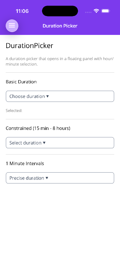
A standalone duration picker control. Tapping it opens a FloatingPanel containing hour and minute pickers (with “hr”/“min” labels) and Done/Cancel buttons. The selected value is exposed as a TimeSpan? via the two-way bindable Duration property.

Important: Placement Requirement
Section titled “Important: Placement Requirement”DurationPicker uses a FloatingPanel internally, so it must be placed inside a page that provides an overlay host — use ShinyContentPage (recommended) or add an OverlayHost to the visual tree, exactly like a standalone FloatingPanel. Placing it on a plain ContentPage will not display the picker.
Basic Usage
Section titled “Basic Usage”<shiny:ShinyContentPage xmlns="http://schemas.microsoft.com/dotnet/2021/maui" xmlns:x="http://schemas.microsoft.com/winfx/2009/xaml" xmlns:shiny="http://shiny.net/maui/controls" x:Class="MyApp.DurationPage" Title="Duration"> <shiny:ShinyContentPage.PageContent> <VerticalStackLayout Padding="20" Spacing="20">
<shiny:DurationPicker Duration="{Binding SelectedDuration, Mode=TwoWay}" Placeholder="Choose duration" />
</VerticalStackLayout> </shiny:ShinyContentPage.PageContent></shiny:ShinyContentPage>Constraints & Intervals
Section titled “Constraints & Intervals”MinDuration/MaxDuration clamp the selected value, and MinuteInterval controls the minute step shown in the picker (e.g. 1 for every minute, 15 for quarter-hours).
<!-- 15 minutes to 8 hours, 5-minute steps --><shiny:DurationPicker Duration="{Binding MeetingLength, Mode=TwoWay}"                      MinDuration="0:15:00"                      MaxDuration="8:00:00"                      MinuteInterval="5"                      Placeholder="Select duration" />
<!-- Precise: every minute up to 2 hours --><shiny:DurationPicker Duration="{Binding Timer, Mode=TwoWay}"                      MinuteInterval="1"                      MaxDuration="2:00:00"                      Placeholder="Precise duration" />
Properties
Section titled “Properties”| Property | Type | Default | Description |
|---|---|---|---|
Duration |
TimeSpan? |
null |
Selected duration (two-way bindable) |
MinDuration |
TimeSpan |
0:00:00 |
Minimum allowed duration; the result is clamped to this |
MaxDuration |
TimeSpan |
24:00:00 |
Maximum allowed duration; also caps the hours shown in the picker |
MinuteInterval |
int |
5 |
Minute increment step shown in the minute picker |
Format |
string |
h\:mm |
.NET TimeSpan format string used for the display text |
Placeholder |
string |
Select duration |
Text shown when no duration is selected |
PlaceholderColor |
Color |
Gray |
Placeholder text color |
TextColor |
Color? |
null |
Selected-duration text color |
FontSize |
double |
16 |
Display font size |
Title |
string |
Select Duration |
Heading across the top of the picker panel |
HoursPickerTitle |
string |
Hours |
Title of the hours Picker |
MinutesPickerTitle |
string |
Minutes |
Title of the minutes Picker |
HourUnitText |
string |
hr |
Unit label beside the hours picker |
MinuteUnitText |
string |
min |
Unit label beside the minutes picker |
DoneText |
string |
Done |
Confirm button text |
CancelText |
string |
Cancel |
Cancel button text |
Localizing the Dialog
Section titled “Localizing the Dialog”Every string the panel draws is its own bindable property, so they bind to a resource lookup the same way any other property does — there is no strings object to replace and no subclass to write. Localizer below is a generated resource class — see LocalizeGen — but any binding source works.
<shiny:DurationPicker Duration="{Binding MeetingLength, Mode=TwoWay}" Placeholder="{Binding Localizer.DurationPlaceholder}" Title="{Binding Localizer.DurationTitle}" HoursPickerTitle="{Binding Localizer.Hours}" MinutesPickerTitle="{Binding Localizer.Minutes}" HourUnitText="{Binding Localizer.HourAbbreviation}" MinuteUnitText="{Binding Localizer.MinuteAbbreviation}" DoneText="{Binding Localizer.Done}" CancelText="{Binding Localizer.Cancel}" />Each one defaults to the English literal the control has always rendered, so setting none of them leaves the picker exactly as it was.
Events
Section titled “Events”| Event | Signature | Description |
|---|---|---|
DurationSelected |
EventHandler<TimeSpan> |
Raised when the user taps Done, with the clamped selected value |
TableView: DurationPickerCell
Section titled “TableView: DurationPickerCell”Inside a TableView use DurationPickerCell, which wraps the same FloatingPanel-based picker as a settings-style row. It adds PickerTitle, a SelectedCommand (ICommand invoked with the chosen TimeSpan), and ValueTextColor, and shares Duration, MinDuration, MaxDuration, Format, and MinuteInterval. Its dialog buttons localize through DoneText and CancelText, and PickerTitle is the cell’s equivalent of the standalone control’s Title.
<shiny:TableViewCell> <shiny:DurationPickerCell Text="Reminder" Duration="{Binding Reminder, Mode=TwoWay}" MinuteInterval="15" PickerTitle="Remind me after" /></shiny:TableViewCell>As with the standalone control, the hosting page must use ShinyContentPage (or an OverlayHost) so the floating panel has somewhere to render.
Step 1 — Add the marketplace:
claude plugin marketplace add shinyorg/skillsStep 2 — Install the plugin:
claude plugin install shiny@shinyOne plugin installs all 35 Shiny skills. Your agent loads only the skill relevant to what you're building, so there's no cost to having them all available.
Step 1 — Add the marketplace:
copilot plugin marketplace add https://github.com/shinyorg/skillsStep 2 — Install the plugin:
copilot plugin install shiny@shinyOne plugin installs all 35 Shiny skills. Your agent loads only the skill relevant to what you're building, so there's no cost to having them all available.